


Knowing how to make a hollow circle in Canva is a two-setting job once you know where the second setting hides. Add a plain circle, give it a border, then set its fill colour to no colour at all. What is left is the outline.
The reason this gets searched so often is that the fill control and the border control look almost identical in the toolbar, and the option that removes a fill is a small crossed-out swatch rather than anything labelled transparent. This guide covers that route, the ready-made ring elements that skip it, and the trick to avoid.
The short version
Press C to drop a circle on the page. In the toolbar above the canvas, open the border control, choose a solid line and raise Stroke weight above zero. Then open the fill colour swatch and pick the crossed-out option under Shape colors.
Add the circle
Canva has a keyboard shortcut for this, which is faster than hunting through the Elements panel.
- Press C with the canvas in focus. A filled circle appears in the middle of the page, already selected.
- Or open Elements from the left sidebar, scroll to Shapes, and click the circle. Same result, more clicks.
- Hold Shift while resizing if you drag a corner handle, so the circle stays a circle rather than turning into an oval.
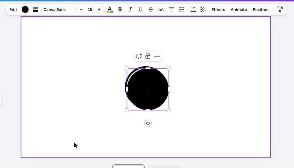
At this point the shape is solid. Two toolbar controls sit next to Edit: a round swatch for the fill colour, and a small stack of lines for the border. Both are needed, in that order.
Give the circle a border
A circle has no border by default, so removing the fill first would leave nothing on the page at all. The border comes first.
- Open the border control in the toolbar. It is the icon made of stacked horizontal lines.
- Choose a line style. Five options sit along the top: none, solid, long dash, short dash and dotted. The first one is crossed out and means no border.
- Raise Stroke weight. It starts at zero, which is why nothing seems to happen until you move it. Drag the slider or type a number into the box beside it.
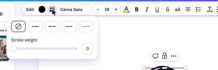
A weight around 10 to 15 reads clearly at slide size. Typing the number is worth doing when several rings have to match, because the slider is hard to land on the same value twice.
A second colour swatch appears in the toolbar once a border exists. That one sets the border colour, and the original swatch still sets the fill. Mixing them up is the other common reason this goes wrong.
Remove the fill
This is the step people search for, because nothing in the colour panel is labelled transparent or none.
- Click the fill swatch in the toolbar. The colour panel opens down the left side.
- Look at the row under Shape colors. It holds a rainbow circle for a custom colour, an eyedropper, a swatch with a diagonal line through it, and the current colour.
- Click the crossed-out swatch. The fill disappears and the circle becomes a ring.
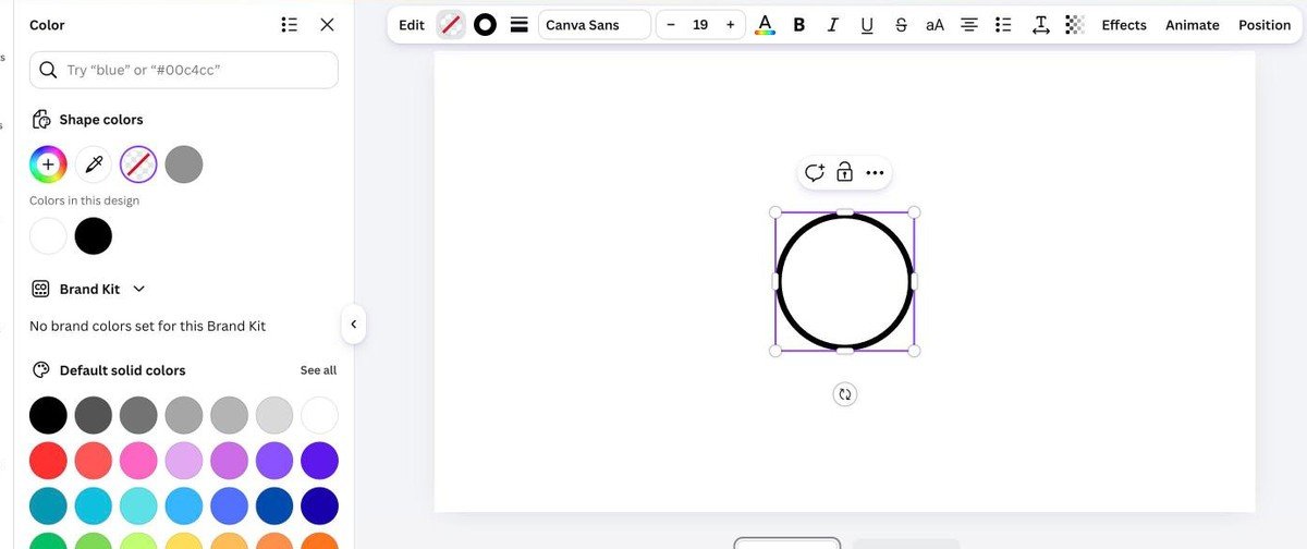
Whatever sits behind the circle now shows through the middle, which is the point. The ring can be moved over a photo, a block of colour or another element and the centre stays genuinely empty rather than painted to match.
The ready-made ring in Elements
Canva also carries outline circles as graphics, and for a quick layout they are faster than setting one up by hand.
- Open Elements in the left sidebar.
- Select Graphics, then search for ring or circle outline.
- Click one to add it, and resize it on the page.
The trade-off is control. A graphic arrives with its thickness baked in, so making the line thinner means scaling the whole element, and some of them are premium. A circle you built yourself can have any weight, any colour and any dash pattern, and it stays sharp at every size.
| Method | Control over the line | Effort |
|---|---|---|
| Border plus no fill | Any thickness and colour you want | Two settings on a plain circle |
| A ring from Elements | Fixed by the graphic you pick | Search for ring or circle outline |
| Two stacked circles | Only works over a flat background | A smaller circle in the background colour |
Dashed, dotted and partial rings
The line style buttons above the Stroke weight slider are what turn a plain ring into something with a bit of character, and they are easy to miss because they look like decoration rather than controls.
- Solid is the default ring, and the right choice for logos, badges and anything that has to hold up when printed small.
- Long dash reads as a cut line or a boundary. It is the usual choice for coupon edges and for marking an area on a diagram.
- Short dash gives a tighter rhythm that stays legible on a thin stroke, which suits annotation over a photograph.
- Dotted is the lightest of the four and works best at a heavier weight, since thin dots tend to vanish at small sizes.
The dash spacing is not adjustable on its own. It scales with the stroke weight, so a thicker line produces longer dashes and wider gaps. Raising the weight is the only way to change the rhythm, which is worth knowing before spending time looking for a control that does not exist.
Sizing the ring precisely
A circle dragged by hand is almost never the exact size you wanted, and two rings that should match rarely do. The Position panel fixes both.
- Select the ring and open Position in the toolbar.
- Switch to the Arrange tab, where Width and Height sit as editable numbers.
- Type the same value into both so the shape stays a true circle.
- Use the alignment buttons in the same panel to centre it on the page rather than nudging it with the arrow keys.
Typing matched numbers is also how you build a set of concentric rings. Place the first ring, duplicate it, then reduce the width and height of the copy by the same amount and centre both on the page. Dragging gets close and the Position panel gets it exact.
The stacked-circles trick, and why to avoid it
A common suggestion is to place a smaller circle in the background colour on top of a larger one, so the middle looks empty. It works on a flat white page and fails everywhere else.
- It is not actually hollow. Move the pair over a photo and the middle shows as a white disc, because it is one.
- It breaks when the background changes. Switching the page colour leaves the inner circle the old shade.
- It doubles the elements and has to be grouped to stay aligned, which is covered in our guide to grouping elements in Canva.
- It cannot be exported with transparency, so a PNG saved with a transparent background still has a white middle.
The border-and-no-fill method has none of those problems and takes the same amount of time. There is no situation where the stacked version is the better answer.
What else the same two controls do
Once the pattern is clear, it applies to every shape in Canva rather than just circles.
- Hollow rectangles and squares work identically. Press R for a rectangle and follow the same two steps.
- Dashed and dotted rings come from the line styles in the same border panel, which is how coupon borders and cut-here lines are made.
- Outlined frames for photos use the same border control on an image rather than a shape.
- Progress rings and badges start as a hollow circle with a second, partial arc on top.
The border control appears on frames and tables too, so the same habit carries across a whole design. Setting one weight and one line style and reusing them is what makes a set of slides look as though it was planned rather than assembled.
A hollow circle is also the usual container for a cut-out photo, since the ring sits around the subject without a box edge cutting through it.
Frequently Asked Questions
Why does my circle disappear when I remove the fill?
The border was never set. Stroke weight starts at zero on a new shape, so taking the fill away leaves an invisible outline with nothing to draw. Set the line style and raise the weight first, then remove the fill.
Can I change the thickness after making it hollow?
Yes. Select the ring, open the border control and move Stroke weight at any time. The shape stays hollow while the line gets thicker or thinner.
Does a hollow circle export with a transparent middle?
Yes, as long as the file type supports it. Download as PNG or WebP with Transparent background switched on, and the centre of the ring comes out genuinely empty.
How do I make a half circle or an arc?
Search Elements for arc or semicircle rather than trying to cut a circle down. Canva shapes cannot be trimmed, so a partial ring has to come from a graphic or be covered by another shape.
Related Articles

Get the Fox Bulletin briefing
The stories that matter, in your inbox. No spam, unsubscribe anytime.
Newsletter signup will be available soon.
Related stories

How to Add Music to Canva Designs and Videos
Adding the track is one click. Trimming it, fading it and exporting in a format that carries sound at all are the three steps that decide whether anyone hears it.

How to Highlight Text in Canva Three Different Ways
One effect does it in two clicks, and its three sliders decide whether the result looks like a marker pen or a solid block.

Connected Carousel in Canva: Build One That Lines Up
The design half is one wide canvas. The half that stops people is the split, because Canva has no built-in command for it and the answer is an app.