


There are three answers to how to highlight text in Canva, and the one you want depends on whether you are highlighting a whole text box, a few words inside a sentence, or something that needs to look hand drawn.
The usual answer is the Background effect, which puts a coloured block behind a text box in two clicks and then gives you three sliders to shape it. Those sliders are the difference between something that reads as a highlighter stroke and something that reads as a label.
The short version
Select the text box, choose Effects in the toolbar above the canvas, and pick Background from the Style options. Then use the Roundness, Spread and Transparency sliders to shape the block, and the Color tile to set its colour.
The three methods compared
They are not interchangeable, and picking the wrong one is why people end up fighting the tool.
| Method | What it covers | What you can control |
|---|---|---|
| Background effect | Whole text box | Roundness, spread, transparency, colour |
| Docs highlighter | Individual words | Colour only |
| Shape behind text | Anything you draw | Everything, including angle and shape |
The Background effect is the right default. It moves with the text, resizes with it and survives edits to the wording, which a shape placed underneath does not.
Highlight a text box with the Background effect
This works on any design, and it applies to the whole text box rather than to selected words inside it.
- Click the text box once so it is selected as an object. A flashing cursor inside it means you are in editing mode, and some controls are hidden there.
- Select Effects in the toolbar above the canvas.
- Choose Background from the Style tiles. It sits among Drop, Glow, Echo, Outline and Splice.
- Adjust the sliders that appear underneath to shape the block.

The colour applies immediately, which can be alarming if the default is dark. The Color tile at the bottom of the settings changes it, and a Remove effect button sits below everything if you want to start again.
What the three sliders actually do
These are where the look is decided, and the defaults are rarely what anyone wants.
| Setting | What it changes | Default |
|---|---|---|
| Roundness | 0 is a sharp rectangle, 100 is a pill | 50 |
| Spread | How far the colour extends past the letters | 50 |
| Transparency | Lower values let the design show through | 100 |
| Color | The highlight colour itself | Current text colour |
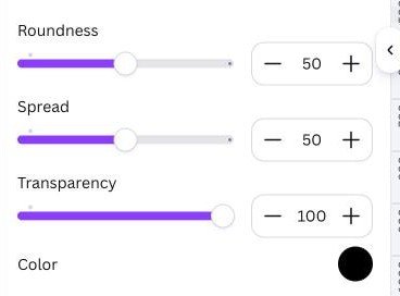
- For a marker pen look, drop Roundness close to zero, raise Spread a little so the colour overshoots the letters, and pull Transparency down to around 60 so the text underneath shows through like real ink.
- For a label or tag, push Roundness up towards 100 for a pill shape and keep Transparency at 100 for a solid block.
- For a subtle emphasis, keep Spread low and Transparency around 30, which tints rather than covers.
- For a block behind a heading, Roundness at zero and Spread high gives a clean rectangle that sits like a banner.
Roundness and Spread interact more than they look. A high Spread with zero Roundness produces a wide flat bar, while the same Spread at full Roundness produces a lozenge that can swallow a short word entirely. Move one, then the other.
Transparency is the slider people miss. At 100 the highlight is opaque and the design behind it disappears, which is what makes an over-highlighted layout look heavy.
Highlighting single words in Canva Docs
The Background effect does not exist in Canva Docs, which catches people out when they move between a design and a document. Docs has its own highlighter instead, and it works the way a word processor does.
- Select the words or phrase you want to mark.
- Choose the highlighter icon in the editor toolbar.
- Pick a colour.
- To take it off later, select the text again and choose No color.
This is the only route that highlights part of a line rather than a whole box, so for marking up a paragraph it is the better tool even though it offers no shape controls at all.
When a shape is the right answer
Some highlights cannot be made with an effect: an angled stroke, a circle around a word, a scribble, or a block that extends well past the text.
- Add the shape from Elements, or press R for a rectangle.
- Set its colour and lower its transparency if it should read as ink rather than paint.
- Send it behind the text with Position, or Ctrl and the left bracket on Windows and Command and the left bracket on a Mac.
- Group the shape and the text so they move together afterwards.
That last step matters more than it sounds. A shape behind text is two separate elements, and without grouping they drift apart the first time the layout is rearranged. Our guide to grouping elements in Canva covers the shortcut.
A shape also handles the case the effect cannot touch at all: highlighting across two separate text boxes, or marking a region of a page that contains an image as well as words. The effect is tied to one box; a shape is tied to nothing.
Elements also carries hand-drawn highlighter graphics, searchable as highlight or brush stroke. They give the loose marker look that a rectangle cannot, at the cost of having to resize them by hand for every line.
Keeping highlighted text readable
A highlight is meant to draw the eye to one thing, and most of the ways it goes wrong come from forgetting that.
- Highlight one idea per page. Three highlights on a slide cancel each other out and the page reads as noise.
- Check the contrast. Yellow highlight under white text is unreadable, and it is the most common pairing people try.
- Mind the line spacing. On multiple lines the blocks can touch or overlap, so open the spacing slightly once the effect is on.
- Watch the edges. A high Spread value on a tight layout pushes the colour into neighbouring elements.
For anything going to print, check the highlight at final size rather than at editor zoom. A pale tint that reads clearly on a monitor can vanish entirely on paper, in the same way a PDF export can shift colours between the screen and the page.
Matching the highlight to the design
A highlight is a block of flat colour dropped into a layout, which makes it one of the loudest things on a page. Getting it to sit properly is mostly about restraint.
- Take the colour from the design, not the default. The eyedropper in the colour picker lifts a shade already in the layout, which looks deliberate in a way a stock yellow never does.
- Use a tint of your brand colour rather than the colour itself. Full strength behind text usually fights the type; the same hue at 30 percent transparency does not.
- Keep one highlight style per document. A pill shape on one slide and a sharp rectangle on the next reads as two designers.
- Leave breathing room. A highlight needs clear space around it or the emphasis is lost in the clutter it sits in.
Saving the settings is worth a minute on a long document. Copy a highlighted text box, paste it where the next highlight goes and retype the words, which carries the exact roundness, spread and transparency across rather than approximating them by eye.
The other Style effects beside Background
Background shares the Style section with eight other treatments, and two of them solve problems people reach for a highlight to fix.
- Drop adds a shadow behind the letters, which lifts text off a busy photograph without covering any of it.
- Glow softens a halo around the type, useful where a hard-edged block would be too heavy.
- Outline draws a border on each letter, which keeps text legible over an image while leaving the image visible.
- Splice and Hollow are display treatments rather than legibility ones, and belong on headlines instead of body copy.
If the real problem is text disappearing into a photograph, Drop or Outline usually beats a highlight, because they solve the contrast without putting a rectangle over the picture.
Frequently Asked Questions
Can I highlight just a few words in a design?
Not with the Background effect, which applies to a whole text box. Split the words into their own text box, or place a shape behind them, or use Canva Docs where the highlighter works on a selection.
Why is Background missing from my Effects panel?
Either the text box is in editing mode rather than selected as an object, or you are in Canva Docs, where text effects are not available on regular document text.
How do I remove a highlight?
Open Effects and choose None, or use the Remove effect button at the bottom of the settings. In Canva Docs, select the text and pick No color from the highlighter.
Can the highlight be a gradient?
No. The Background effect takes a single solid colour. A gradient highlight has to be a shape placed behind the text, where gradient fills are available.
Related Articles

Get the Fox Bulletin briefing
The stories that matter, in your inbox. No spam, unsubscribe anytime.
Newsletter signup will be available soon.
Related stories

How to Add Music to Canva Designs and Videos
Adding the track is one click. Trimming it, fading it and exporting in a format that carries sound at all are the three steps that decide whether anyone hears it.

Connected Carousel in Canva: Build One That Lines Up
The design half is one wide canvas. The half that stops people is the split, because Canva has no built-in command for it and the answer is an app.

How to Create a QR Code in Canva That Keeps Working
The code takes a minute. Choosing between a static and a dynamic one is the decision that matters, because only one of them can be repointed after printing.