


A connected carousel in Canva is one wide picture cut into square slides, so that swiping through the post scrolls across a single continuous image. The design is straightforward. The step that sends people searching is the cut.
Canva has no menu command that slices a design into equal pieces. The split is done by an app instead, and the Canva app directory carries several built for this one job. What follows is the canvas size, the split, and the things that make a seam show.
The short version
Create a custom size design 1080 pixels wide for each slide you want, so four slides is 4320 by 1080. Lay the artwork out across the whole width. Then split it into separate square files with a splitter app from the Canva Apps panel, and upload the slides to Instagram in order.
Start with the right canvas
The maths is the whole of it. Each slide is 1080 pixels wide, so the canvas is 1080 multiplied by the number of slides, at the height a single slide should be.
- Decide the slide count first. Changing it later means rebuilding, because a Canva design cannot be resized without scaling everything on it.
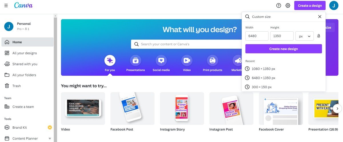
- Open Create a design from the Canva home page and choose Custom size.
- Enter the width and height in pixels, then select Create new design.
| Carousel | Canvas size | Notes |
|---|---|---|
| Square, 3 slides | 3240 x 1080 px | Each slide 1080 x 1080 |
| Square, 4 slides | 4320 x 1080 px | The most common setup |
| Square, 5 slides | 5400 x 1080 px | About the practical limit for one image |
| Portrait, 3 slides | 3240 x 1350 px | Taller slides take more feed space |
| Portrait, 4 slides | 4320 x 1350 px | Each slide 1080 x 1350 |
Three to five slides is the sensible range. Beyond five the image gets so wide that each slide carries almost nothing, and the effect stops reading as one picture and starts reading as a smear.
Design across the whole width
The point of the wide canvas is that nothing respects the slide boundaries. A photograph, a sky, a line or a pattern runs straight through where the cuts will fall.

- Turn on rulers and guides with Shift and R, then drop a guide every 1080 pixels so you can see where the cuts will land.
- Keep text inside a single panel. Words split across a seam are unreadable, because the reader only sees one slide at a time.
- Let the background run through. The continuous element is what sells the effect, and it should be the photo, the colour or the pattern rather than the copy.
- Keep faces and logos off the seams, since a face cut in half reads as a mistake rather than as a design choice.
A rough rule is that each slide needs to survive on its own as well as in sequence. Someone scrolling the feed sees slide one by itself, and if it is a meaningless third of a picture they will not swipe.
The split step everyone skips
Canva will not cut the design into separate files from any menu. What it has instead is a set of apps built for this, and they live in the same Apps panel as everything else.
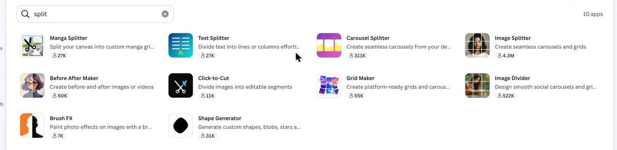
- Open Apps in the editor sidebar and search for split.
- Pick a splitter. Image Splitter is the most used of them, with Carousel Splitter, Image Divider and Grid Maker covering the same ground.
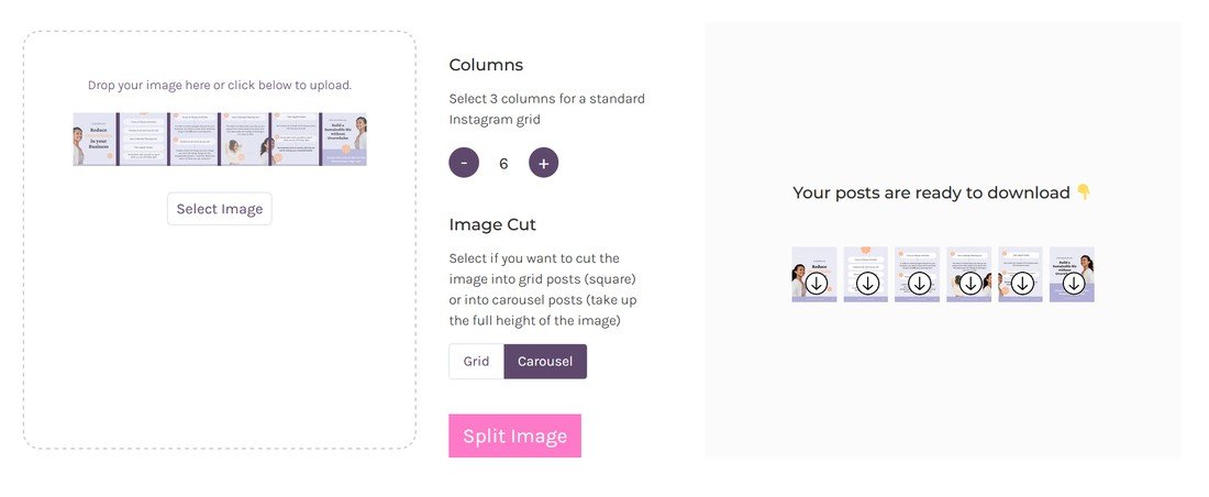
- Set the number of columns to your slide count and leave rows at one.
- Export the pieces, which come out as separate square files in order.
The other route, which works without any app, is to download the wide design as a PNG and split it outside Canva. Plenty of free web tools take a wide image and a column count and hand back the slices.
Either way the output is the same: numbered square files that have to be uploaded in the right order. That ordering is where the last thing goes wrong.
Uploading without breaking the sequence
Instagram does not know your slides are connected. It posts them in the order it receives them, and a gallery picker that sorts by date can scramble that order completely.
- Check the file names. Splitters usually number the output, and that numbering is the only thing keeping the sequence straight.
- Select them one at a time in the Instagram picker rather than tapping select-all, which uses the gallery sort order.
- Review before posting. Swipe through the preview in the app and check the seams line up.
- Do not let Instagram crop them. The slides are already the right aspect ratio, so any crop offered will break the alignment.
If the seams are a pixel out, the cause is nearly always a crop rather than the split. Square slides uploaded to a square post need no adjustment at all.
What makes a seam visible
A carousel that technically works can still look wrong, and it comes down to a handful of recurring problems.
- Compression differences. Exporting at low quality can make adjacent slides sit at slightly different tones across a flat colour. Export at full quality.
- A gradient across the full width. Gentle gradients survive the split well, but a steep one can band differently in each slice.
- Elements landing exactly on a cut. Nudge them a few pixels either way rather than letting a hard edge sit on the seam.
- Mixed slide sizes. Every file has to be identical in dimensions, or Instagram crops to the first one and shifts everything after it.
Keeping the repeated furniture grouped as you build helps here, as our guide to grouping elements in Canva explains, because a logo nudged by accident is the kind of thing nobody notices until the post is live.
When a template beats building it
Canva carries carousel templates already built as separate pages with the artwork pre-split, and for a lot of posts they are the faster answer.
- A template skips the split entirely, because each slide is already its own page and downloads as its own file.
- The seams are already aligned, which removes the fiddliest part of the job.
- You lose the single-image effect, since most templates connect through repeated styling rather than one continuous photograph.
- Grid view is the quickest way to check a multi-page template reads properly as a sequence.
The wide-canvas method is worth the extra steps when the continuous image is the point, such as a panoramic photo or an illustration that flows. For a numbered list of tips, a multi-page template does the job with none of the risk.
Planning the picture before you open Canva
A connected carousel is the one social format where the thinking has to happen before the design, because the slide boundaries are fixed the moment the canvas is created.
- Sketch the full width first, even roughly on paper. Knowing where the subject sits across four panels saves rebuilding the canvas twice.
- Decide what carries across the seams. One continuous element is enough, and it is usually the photograph or the background colour.
- Place the hook on slide one. That is the only panel most people will see, so it has to earn the swipe on its own.
- Leave the last slide for the ask, since a reader who reached it is the one most likely to act on it.
Source photographs wide enough to fill the canvas before you start. A 1080 pixel image stretched across a 4320 pixel canvas is soft on every slide, and no amount of design rescues it. A panoramic shot, or a cut-out subject placed over a wide background, both solve that.
Checking the result before it goes live
The editor shows the carousel as one picture, which is exactly how the audience will never see it. Two checks close that gap.
- View each slide alone. Crop the wide design mentally at each guide and ask whether that panel makes sense in isolation.
- Look at it small. Most people see a feed post at a fraction of full size, where fine text and thin lines disappear.
- Swipe the real post in preview before publishing, which is the only way to see the seams as the reader will.
- Check slide one as a thumbnail, since that is what decides whether anyone swipes at all.
Frequently Asked Questions
Can Canva split a design into slides by itself?
Not from a menu command. The split is done by an app from the Apps panel, such as Image Splitter or Carousel Splitter, or by downloading the wide design and cutting it with a tool outside Canva.
How many slides should a connected carousel have?
Three to five. Fewer than three barely reads as a carousel, and beyond five each slide holds so little of the picture that the effect falls apart.
Why are my slides slightly misaligned?
Almost always a crop during upload, or slides that are not all exactly the same dimensions. Check the exported files are identical in size and refuse any crop Instagram offers.
Can I make a vertical connected carousel?
Yes. Use 1350 pixels for the height instead of 1080 and keep the width at 1080 per slide, so four portrait slides is a 4320 by 1350 canvas.
Related Articles

Get the Fox Bulletin briefing
The stories that matter, in your inbox. No spam, unsubscribe anytime.
Newsletter signup will be available soon.
Related stories

How to Add Music to Canva Designs and Videos
Adding the track is one click. Trimming it, fading it and exporting in a format that carries sound at all are the three steps that decide whether anyone hears it.

How to Highlight Text in Canva Three Different Ways
One effect does it in two clicks, and its three sliders decide whether the result looks like a marker pen or a solid block.

How to Create a QR Code in Canva That Keeps Working
The code takes a minute. Choosing between a static and a dynamic one is the decision that matters, because only one of them can be repointed after printing.